Sixty years of slow-pressed oil deserved a pack that felt just as considered.
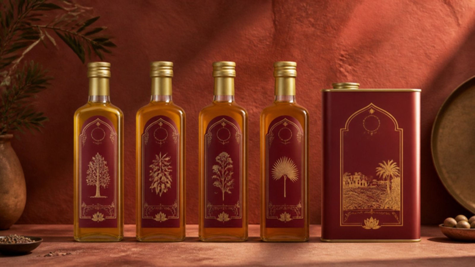
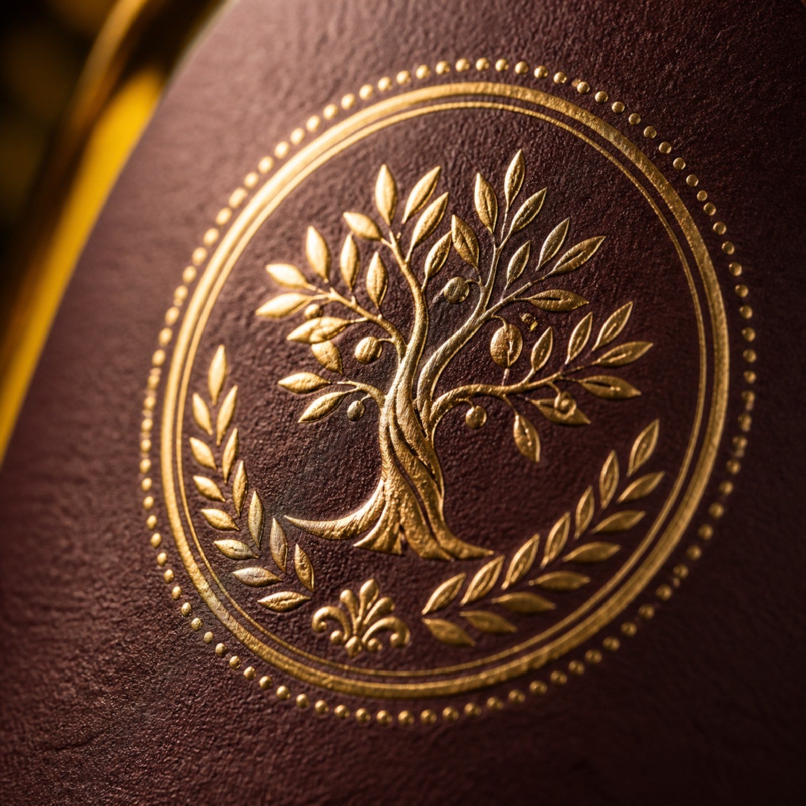
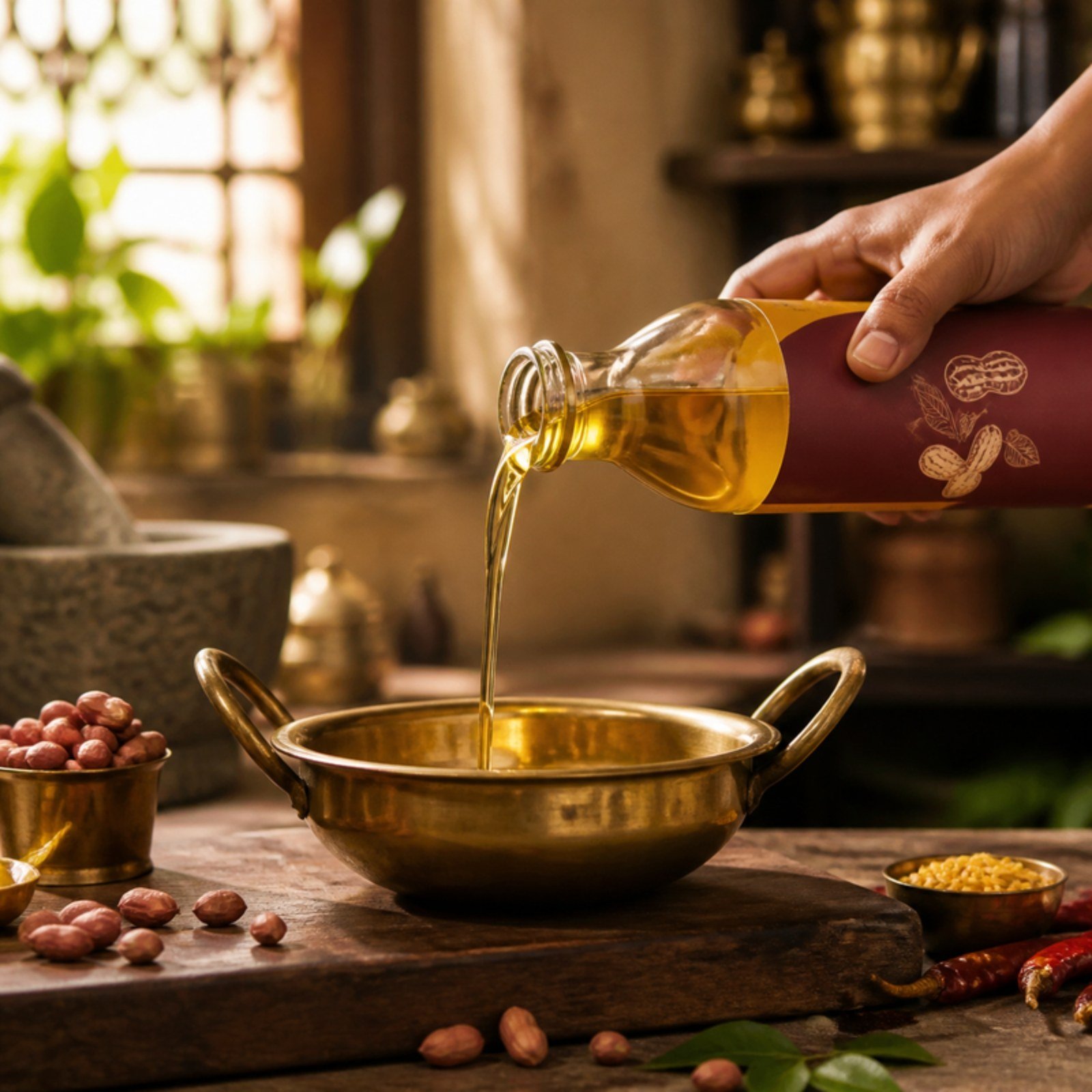
We started where the oil starts: the groundnut plant. Its leaves, pods and roots became an emblem, rendered in gold foil on a deep maroon that no competitor on the shelf was using. Every bottle, tin and pouch now carries the same seal of care.
THANGAM OIL MILLS
Before

Thangam
After
The old wordmark was generic and forgettable. The new identity pairs a groundnut-plant emblem, its pods drawn as a cluster of gold seeds, with a warm, classic serif that speaks of craft and continuity.
Thangam
Cold pressed since 1962

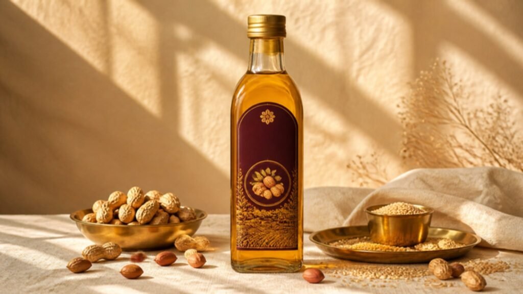
Pressed slowly, never rushed.
Filtered by cloth, never refined.
Sold by families, to families.
Trusted in kitchens for three generations.
Thangam. Pure since 1962.
The emblem stretches across everything Thangam makes.
A family of range icons was built from the same line language, so every variant feels related at a glance.
Groundnut Oil
Sesame Oil
Coconut Oil
Mustard Oil
Glass Bottles
Tins
Gift Packs
Shelf Talkers
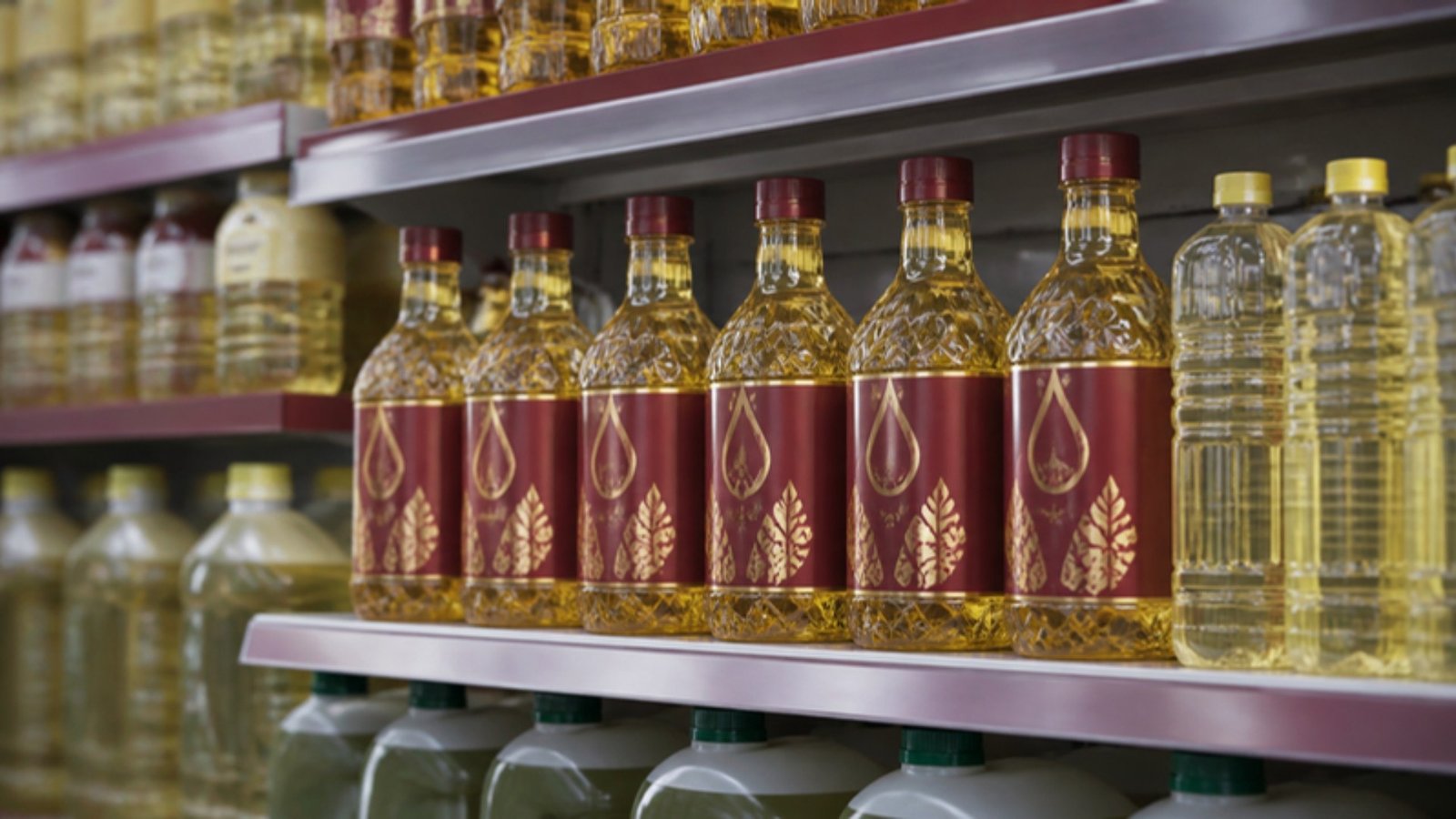
On shelf, the maroon and gold block reads from the end of the aisle. Shoppers find Thangam first, and recognise it every time after.
Sample case study. Brand, copy and imagery are illustrative.